Case study · Client Work
Dream Clean
A redesign built for health store shelves.
01 Challenge
The product worked. The packaging didn’t. Dream Clean kept getting rejected by retailers because their label system was confusing and just didn’t make sense.
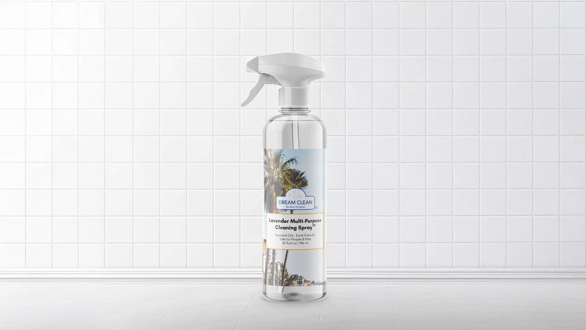
Before, the original label didn’t signal quality or communicate how well the product actually worked.
02 Execution
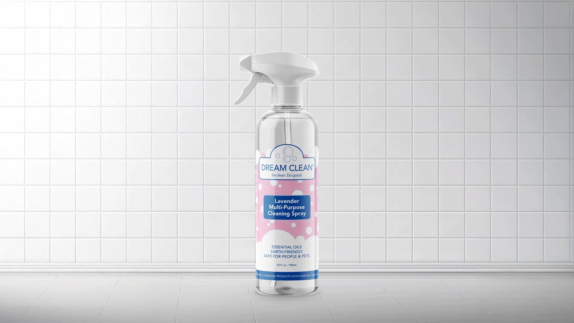
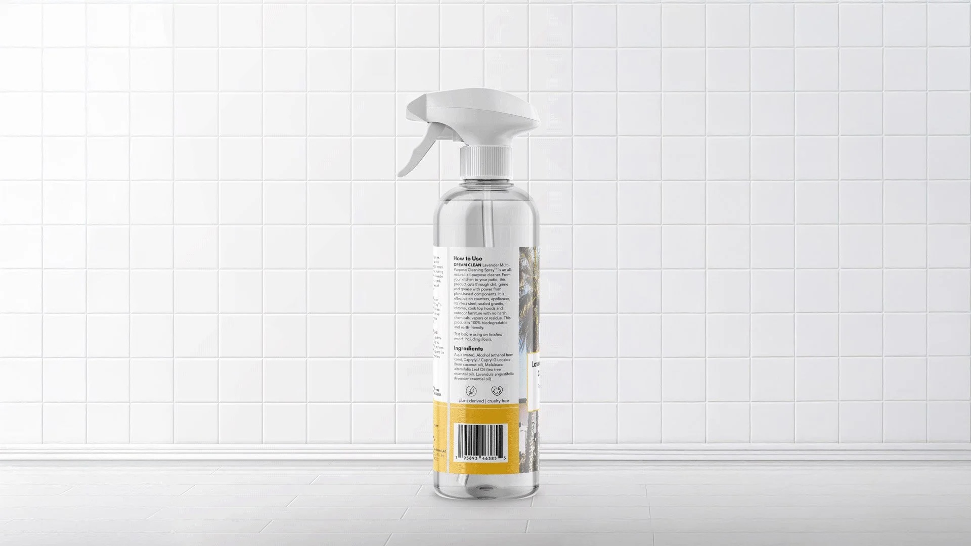
I was asked to make sense of the packaging. I designed a premium labeling approach with custom icons that communicate plant-based, cruelty-free, and safe for people and pets at a glance, anchored by the line “Cleaning products with purpose.” That line also carried the brand’s identity as a woman- and Black-owned, mission-driven business onto the package itself.
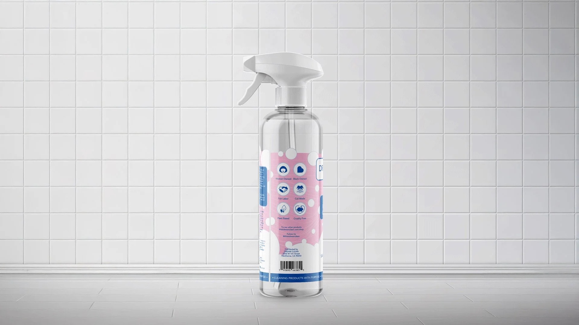
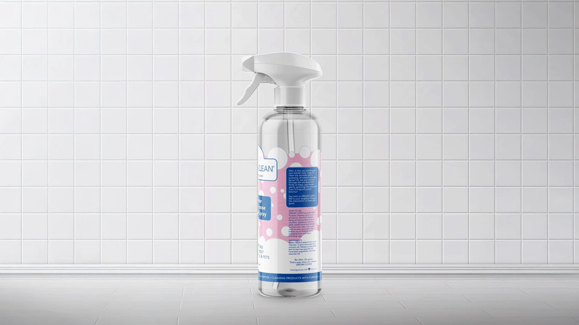
After, a premium look built to signal quality the moment a shopper walks down the aisle.
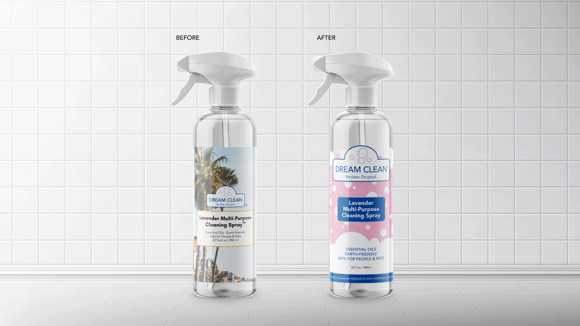
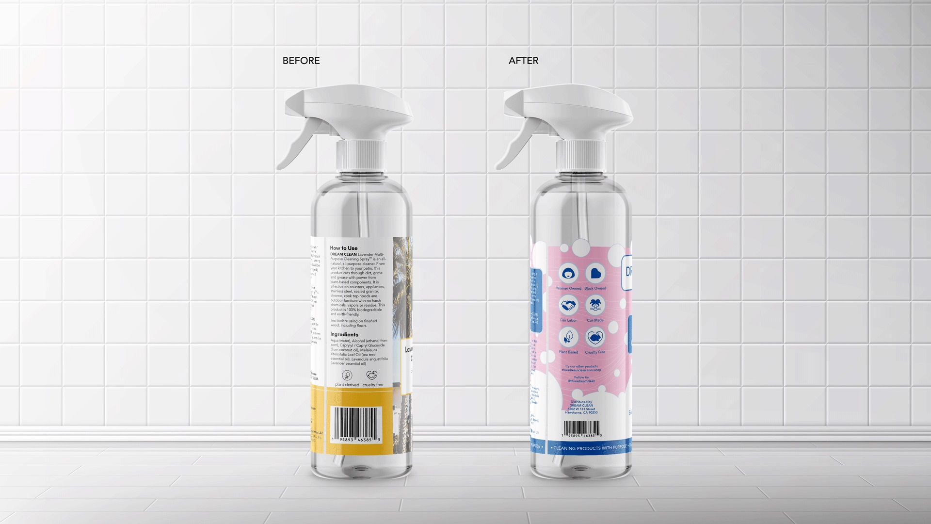
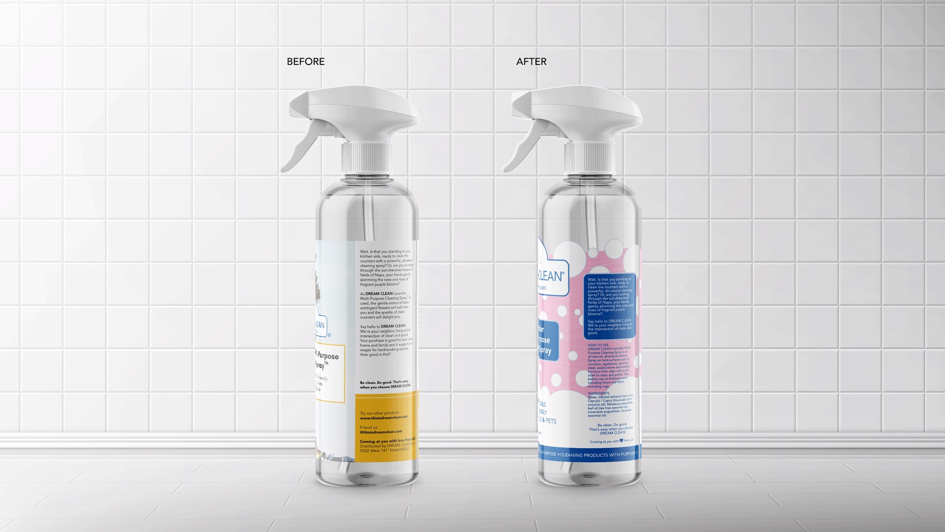
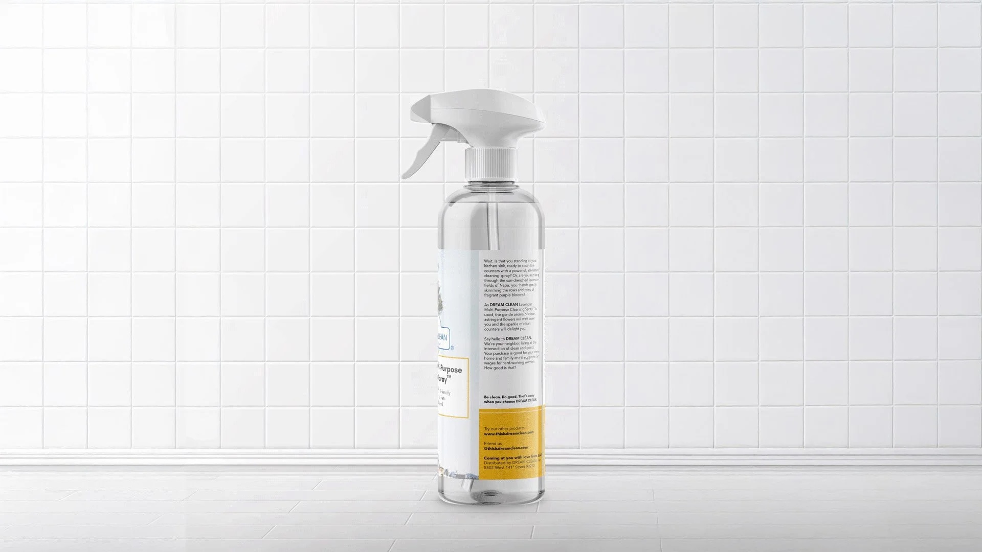
Side by side, the full extent of the redesign, from generic label to a shelf-ready system.
03 Outcome
The rebranded bottles were successful in securing shelf space at Southern California Lazy Acres stores, with expansion plans toward Sprouts and Whole Foods markets. The company also expanded their offerings, growing into a residential and commercial cleaning service using its own products.
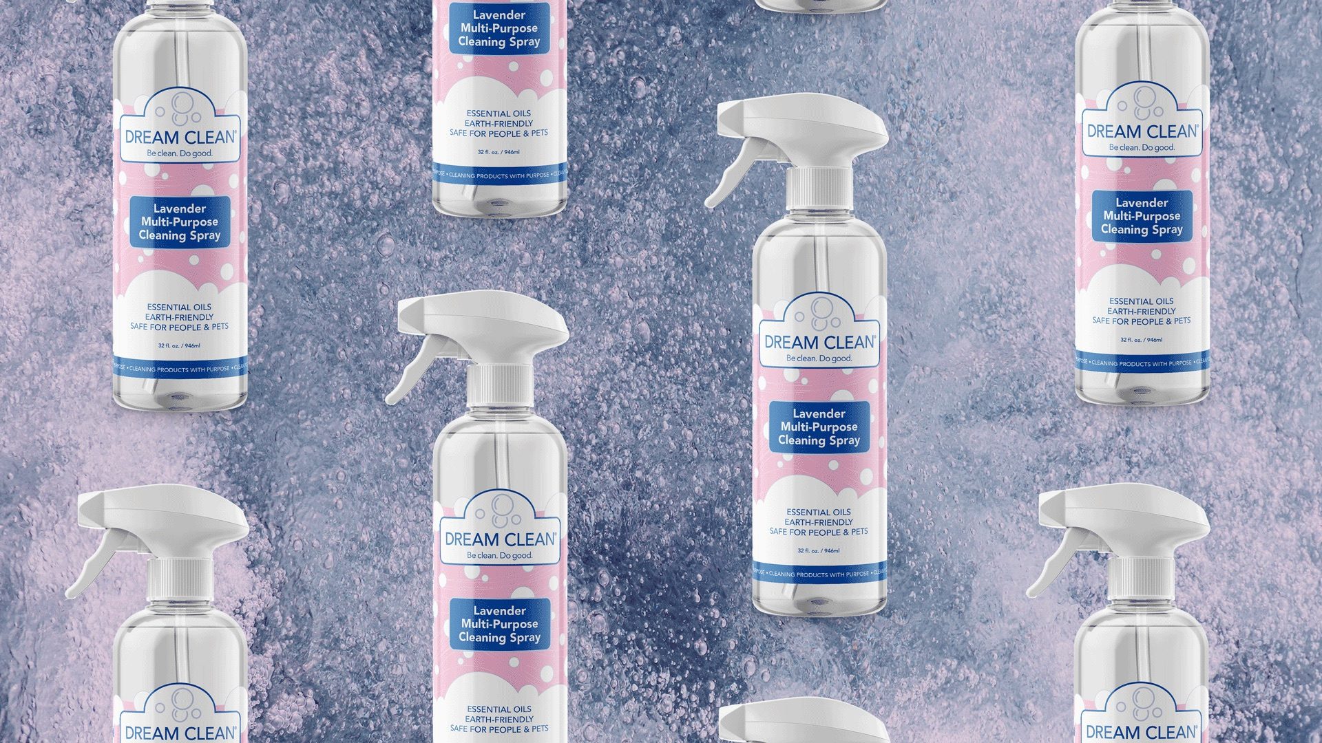
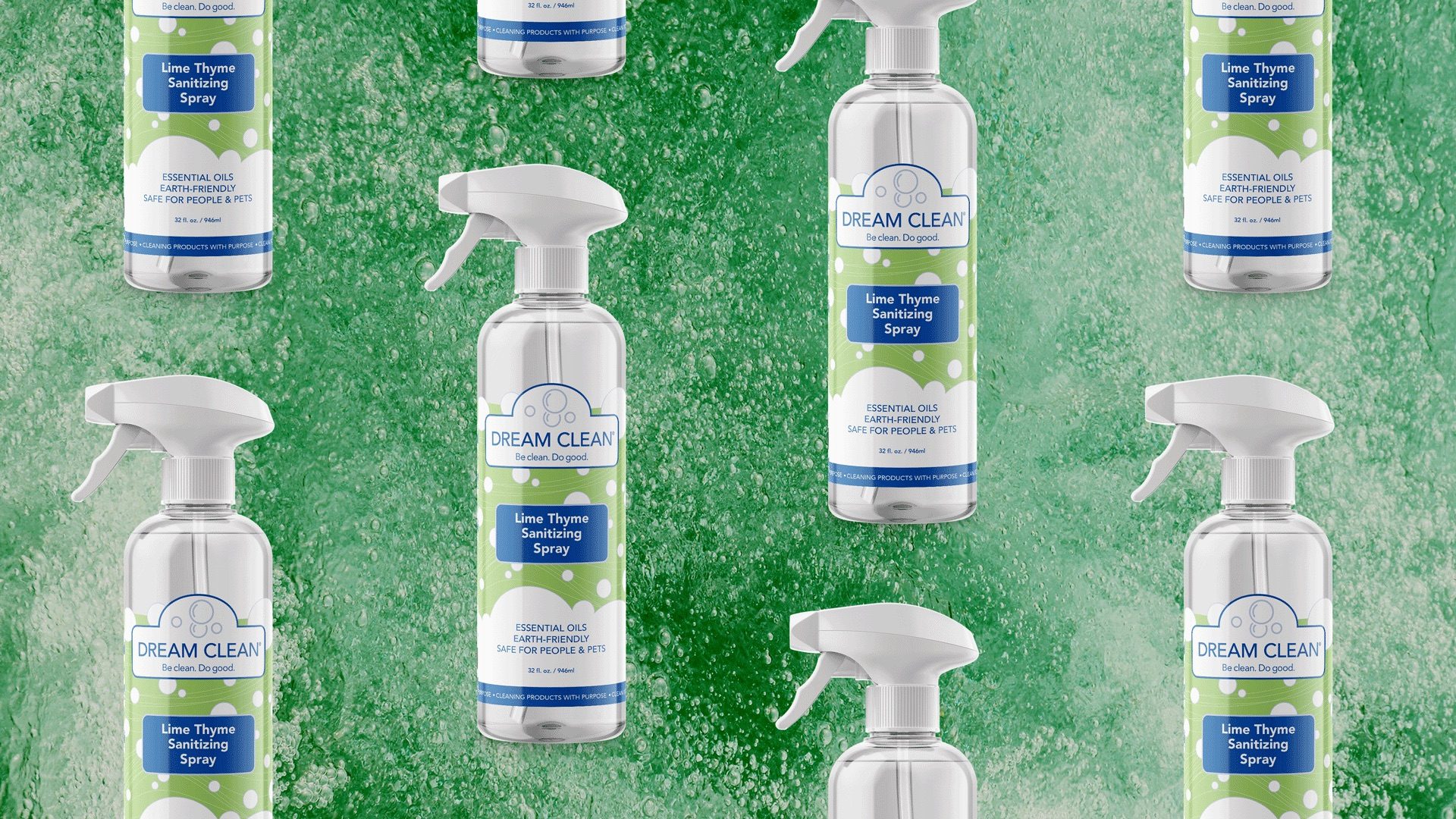
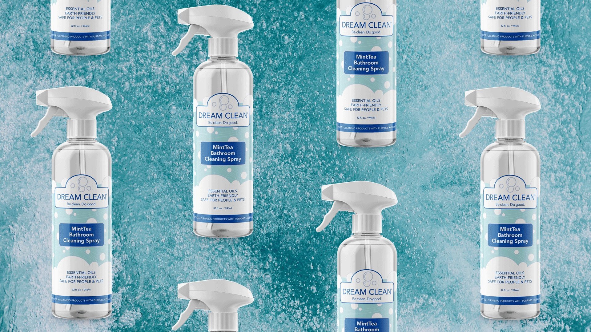
The finished packaging system across the full scent line, Lavender, Lime Thyme, and MintTea.