Case study · Client Work
Mantra
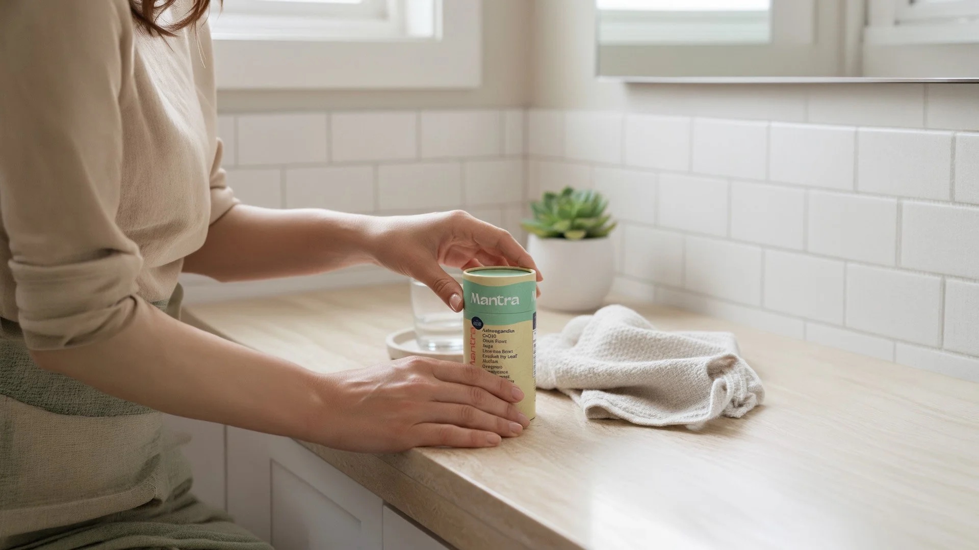
Natural ingredients. A real sense of calm.
01 Challenge
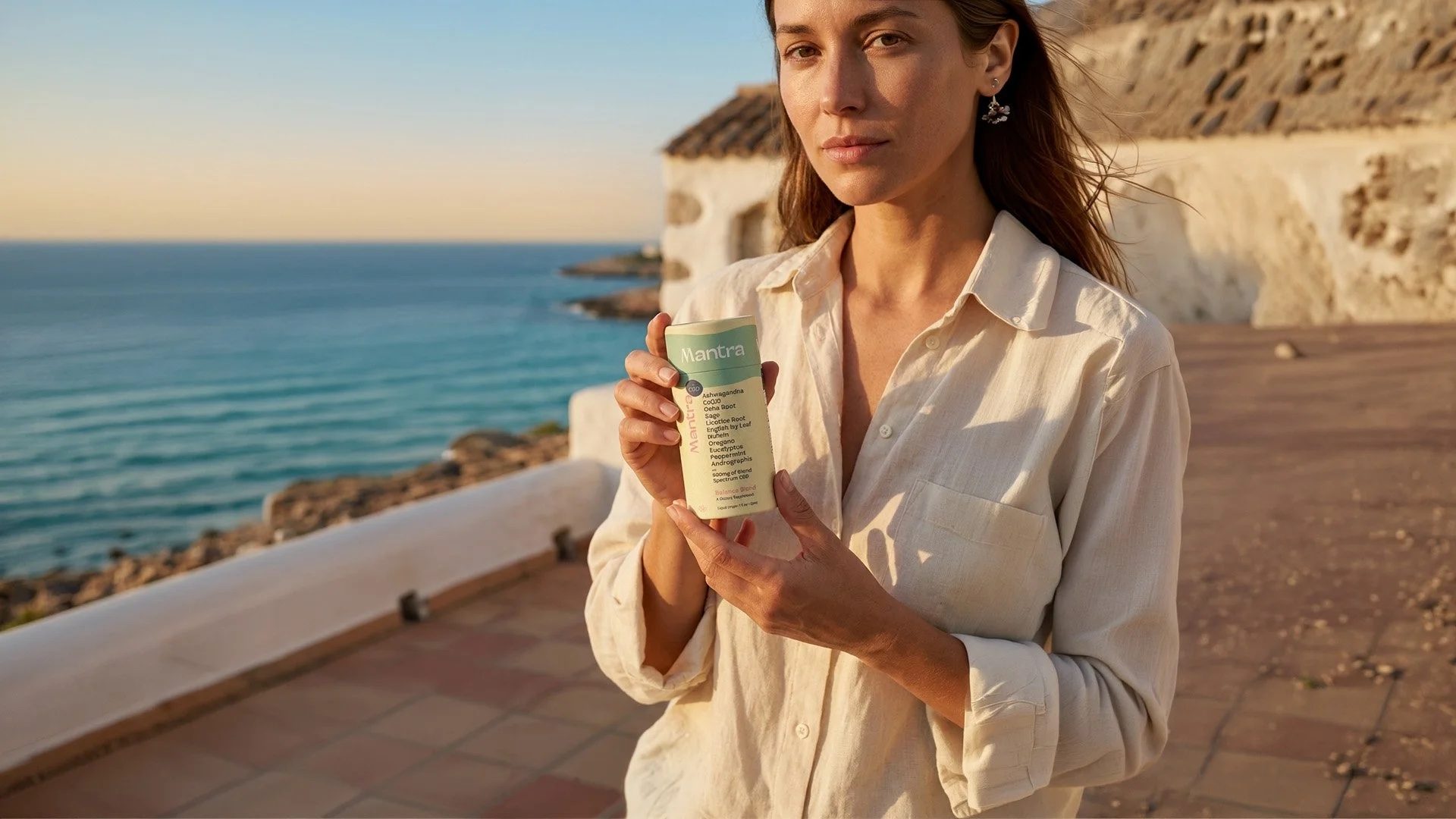
Mantra was entering a crowded wellness market and needed to feel premium yet approachable to health-conscious shoppers in their 30s to 50s, without reading like just another good-for-you brand.
02 Execution
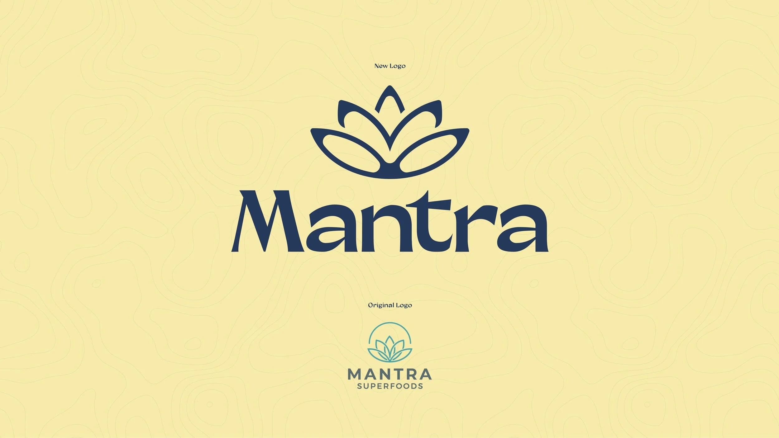
I led creative, including brand and packaging design, for the launch. I also guided the founder through a critical assessment of their unused logo, successfully advocating for a simplified and refined version that captured the premium, approachable feel required for the market. Alongside establishing the core color palette and typography, I developed an ingredient-forward visual system and managed overseas manufacturing to ensure design integrity held up from the factory floor in China to retail shelves in California.
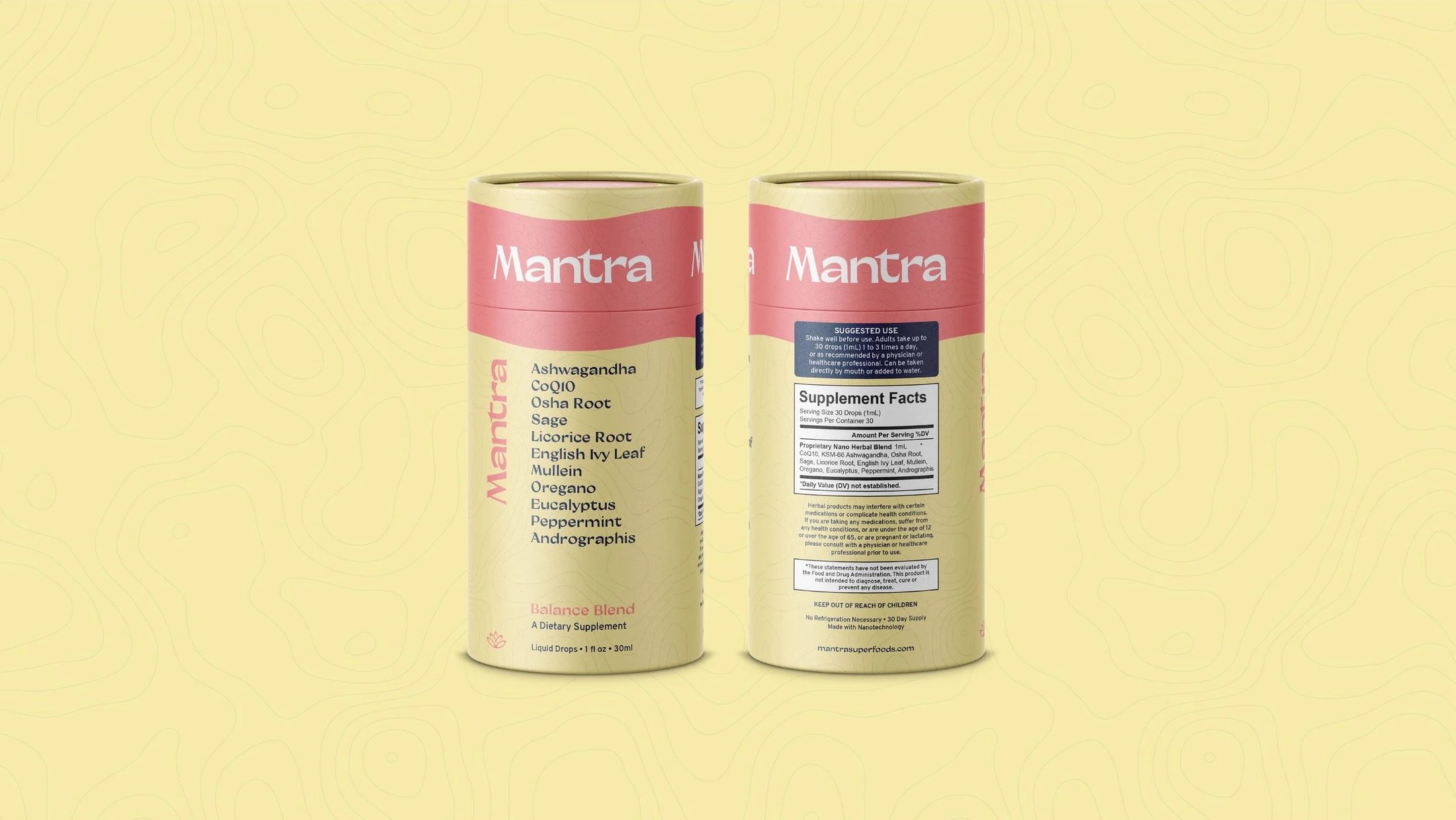
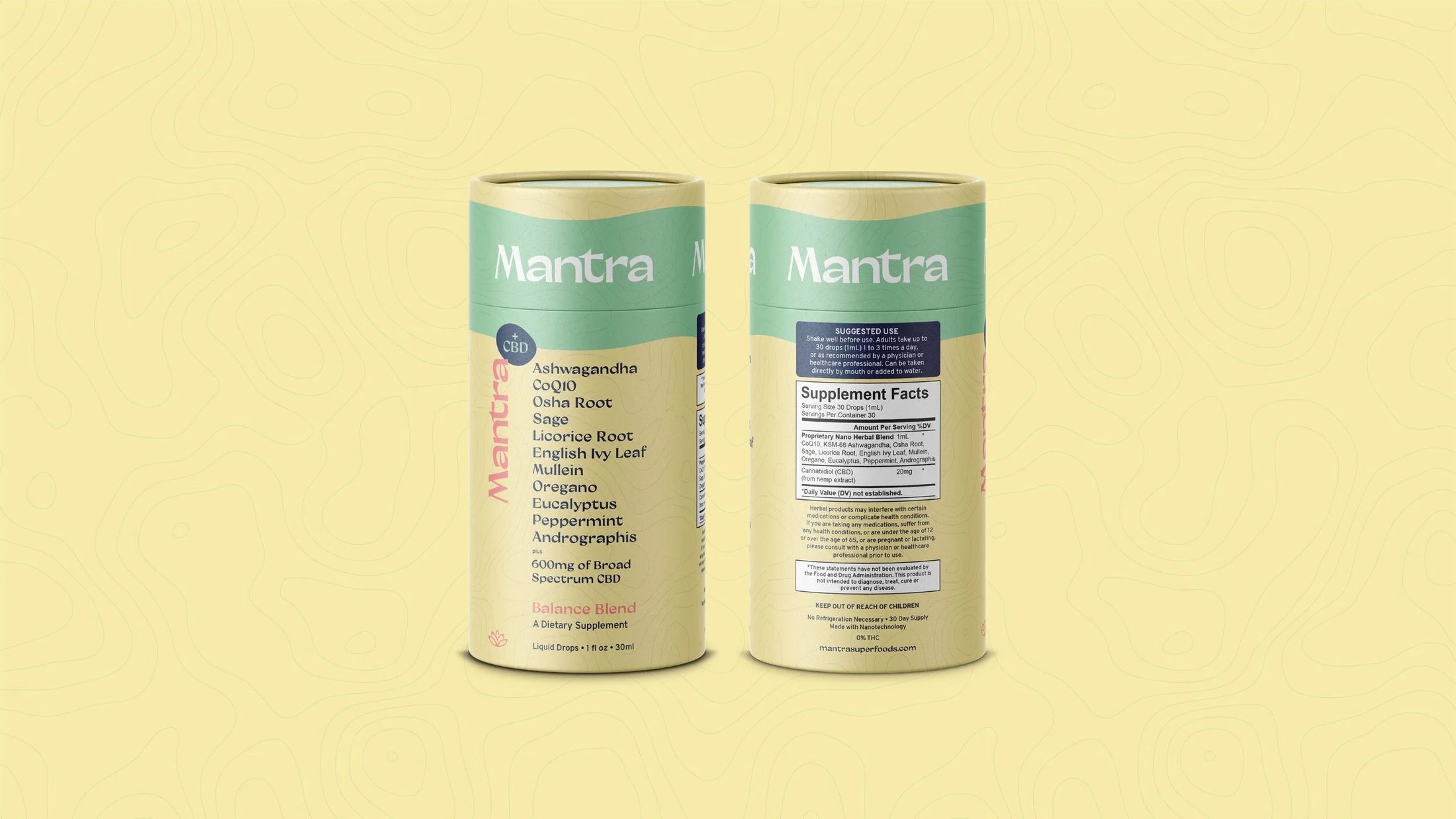
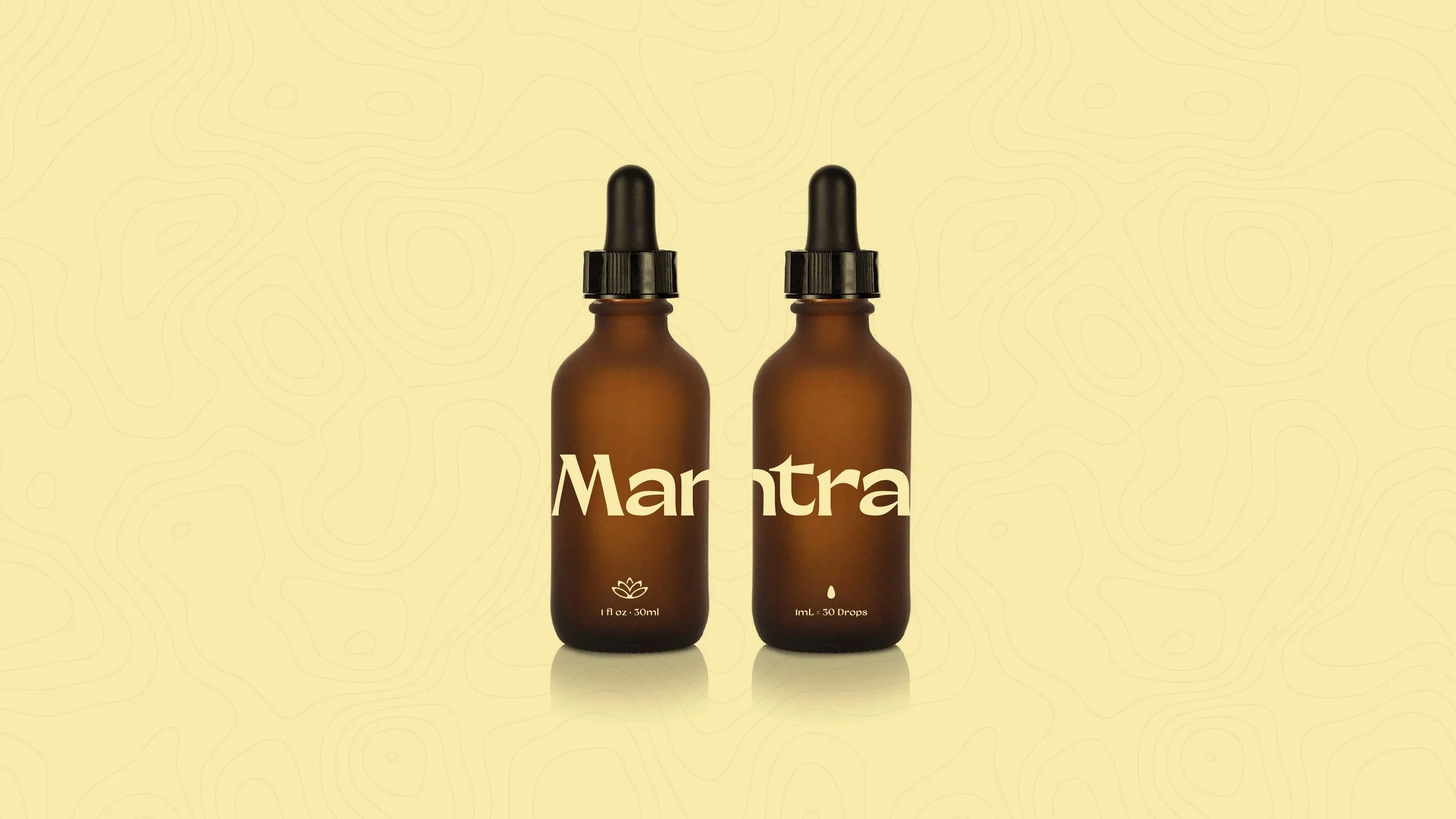
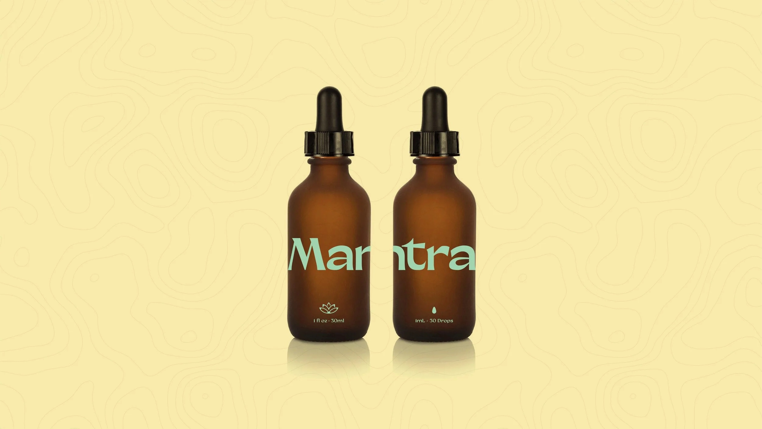
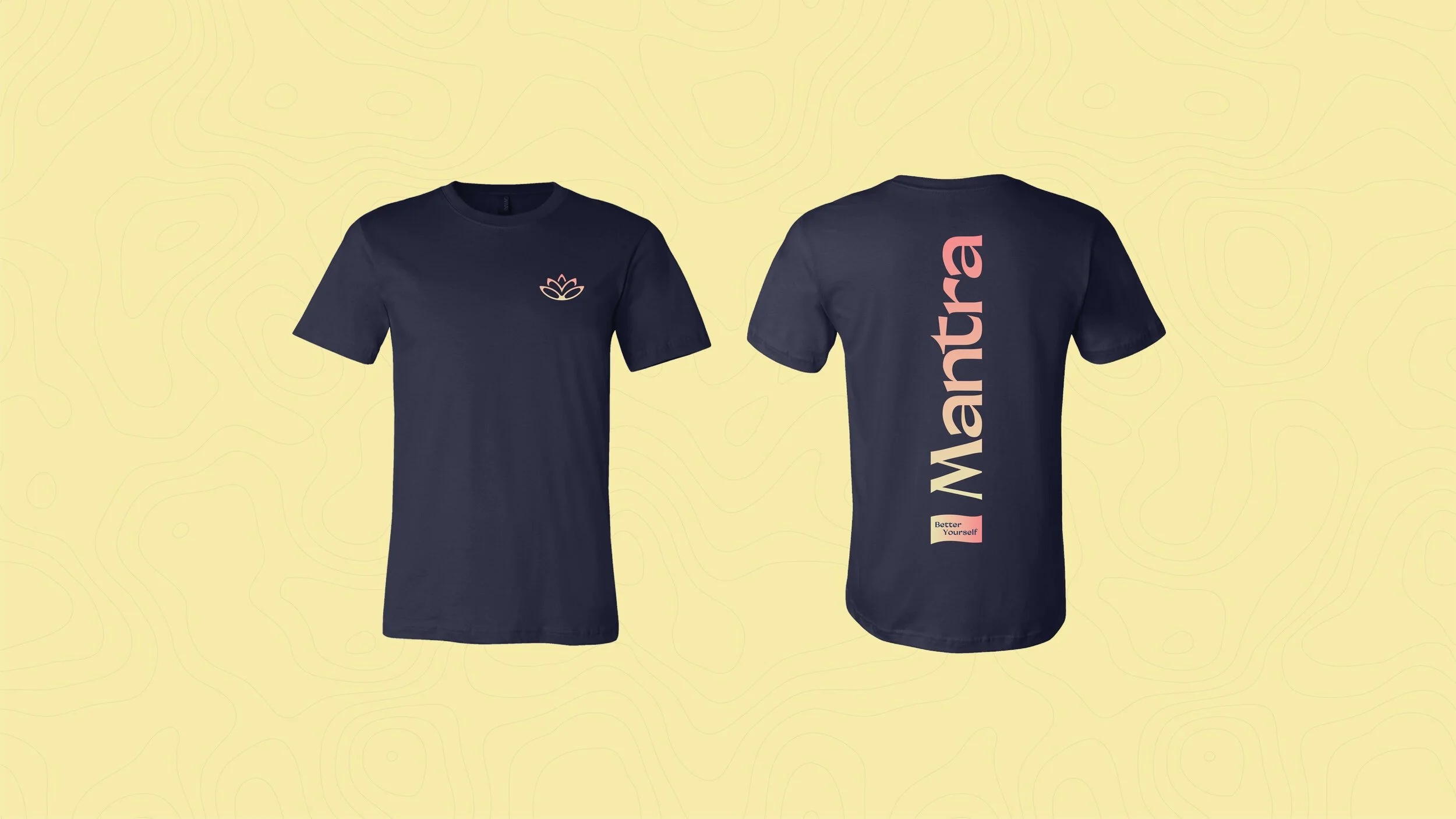
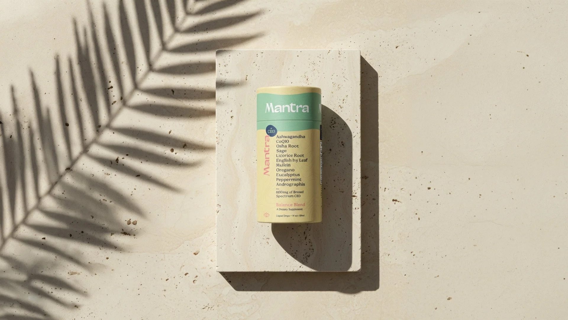
A clean, ingredient forward system designed to fit a Whole Foods shopper’s routine at a glance.
03 Outcome
Working closely with the founder, I built the brand’s visual identity and initial product line with future expansion in mind. Mantra launched with both regular and CBD tinctures, earning strong praise for its prominent, forward-facing ingredient list at a time when competing wellness brands actively worked to hide theirs.