Case study · Client Work
Olio Italian
A modern take on neighborhood Italian.
01 Challenge
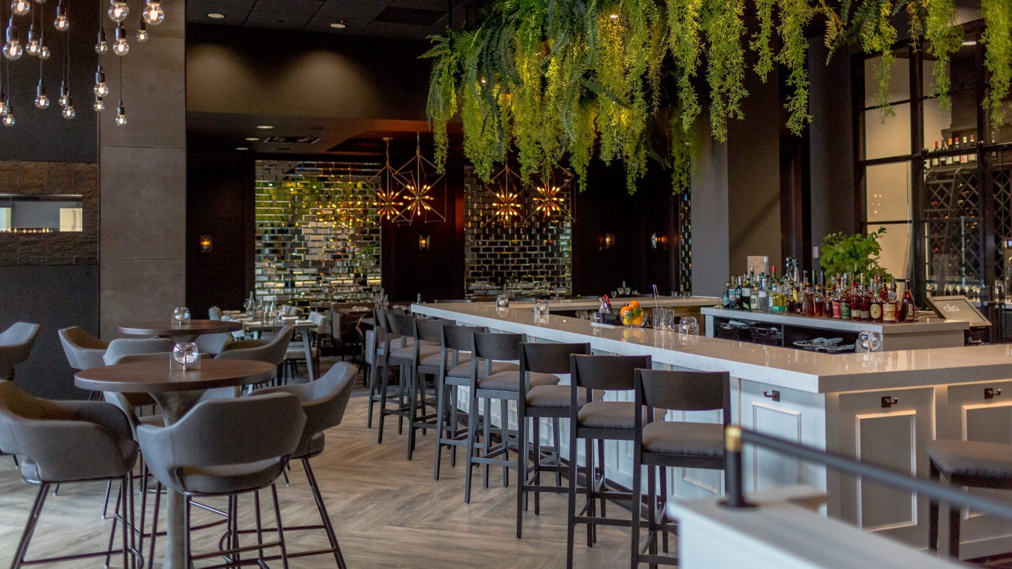
Olio needed a brand identity that honored traditional Italian dining without falling into tired trattoria cliches. The goal was to create an atmosphere and visual style that felt fresh, polished, and genuinely welcoming.
02 Execution
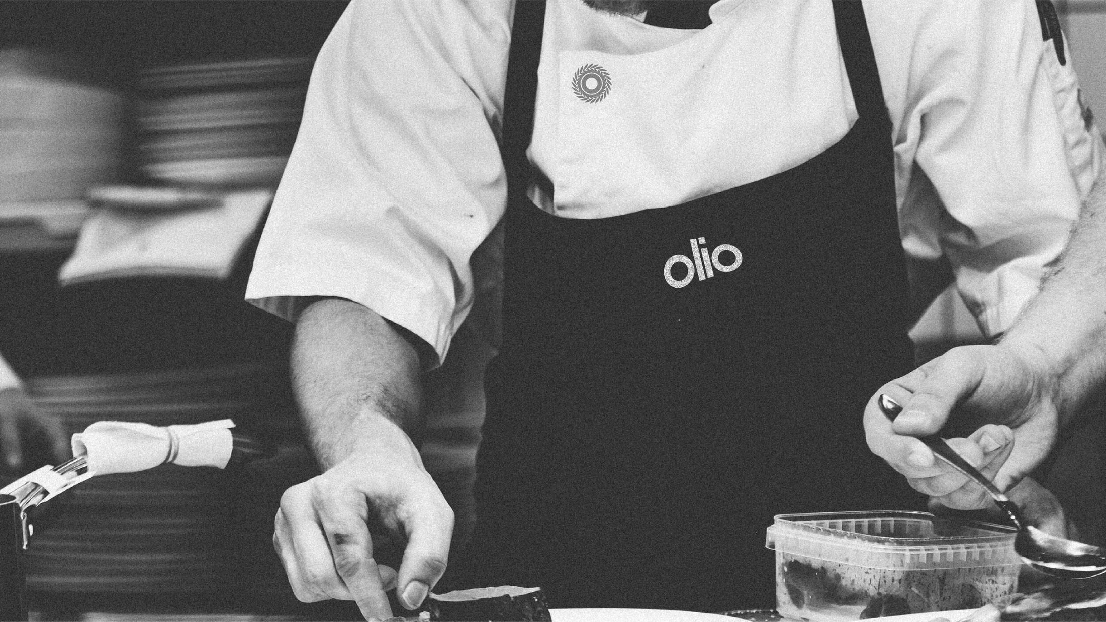
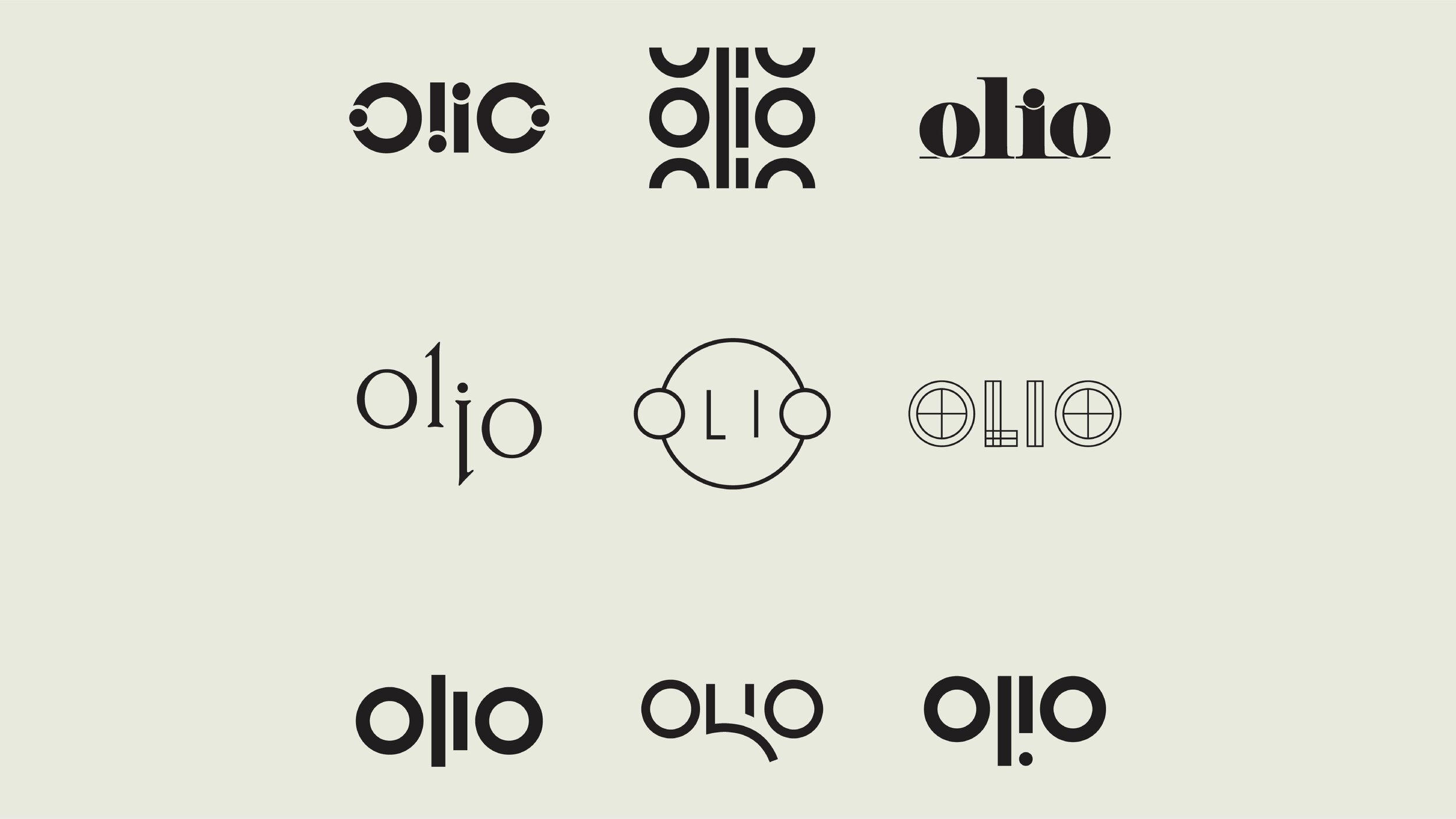
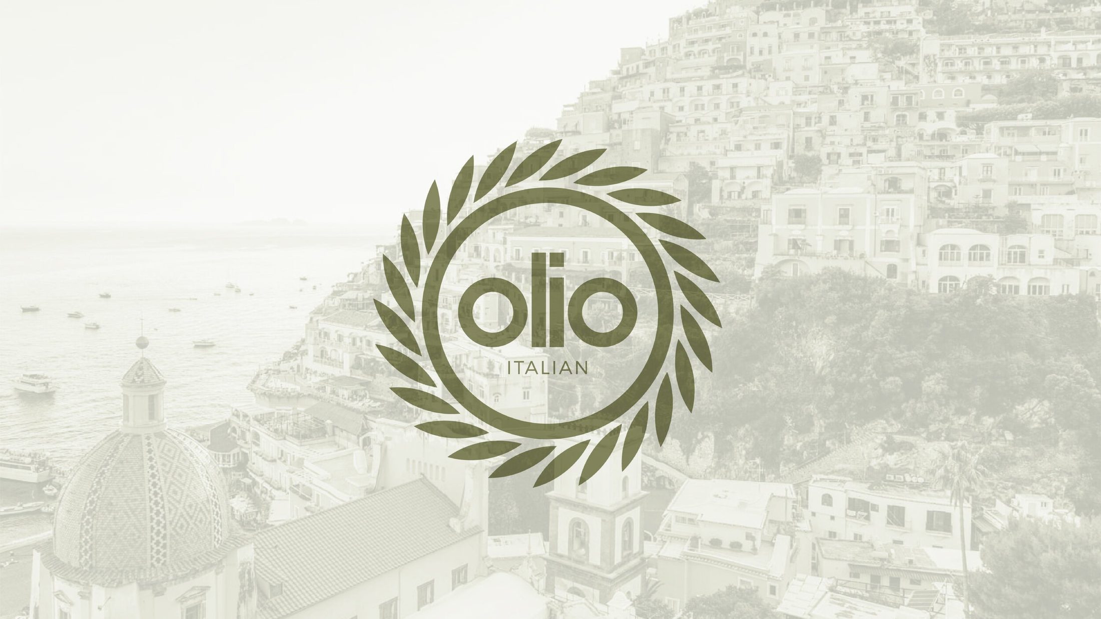
Ownership had already landed on the Olio name, so olive leaves became a natural part of the brand language. I moved the direction away from typical trattoria tropes toward a contemporary look, blending minimalism with classic Italian charm so the visual story matched the actual dining experience.
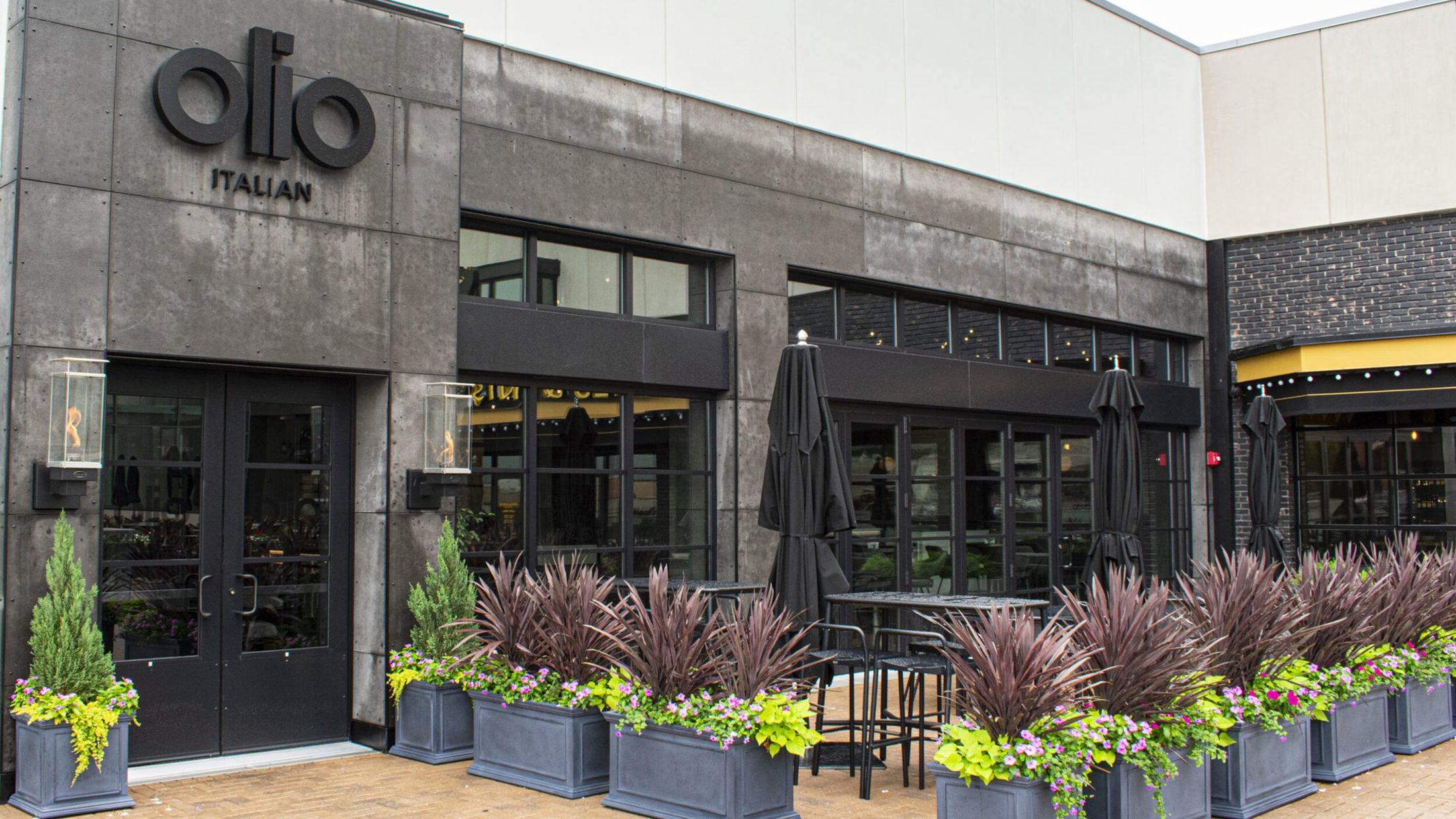
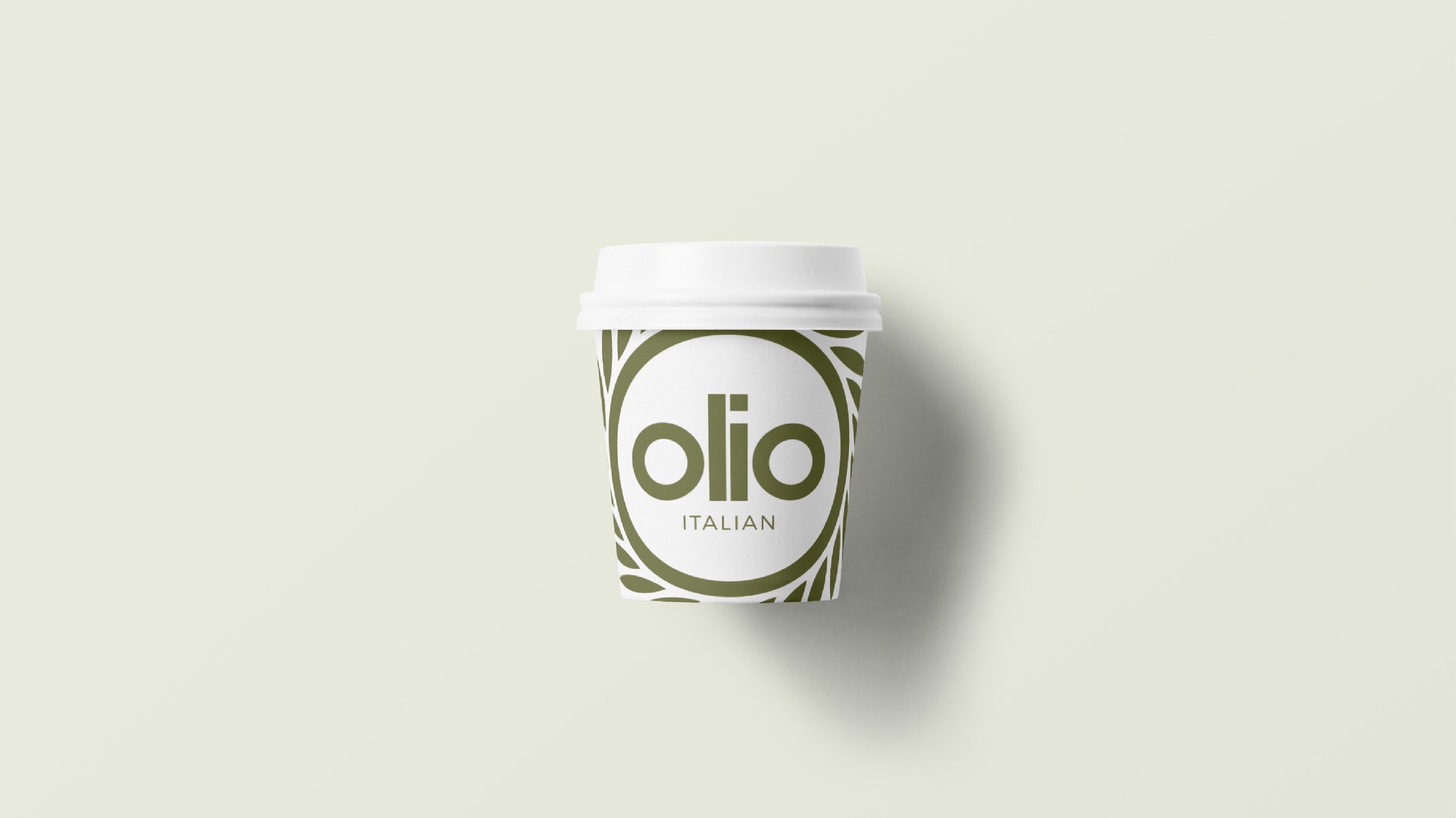
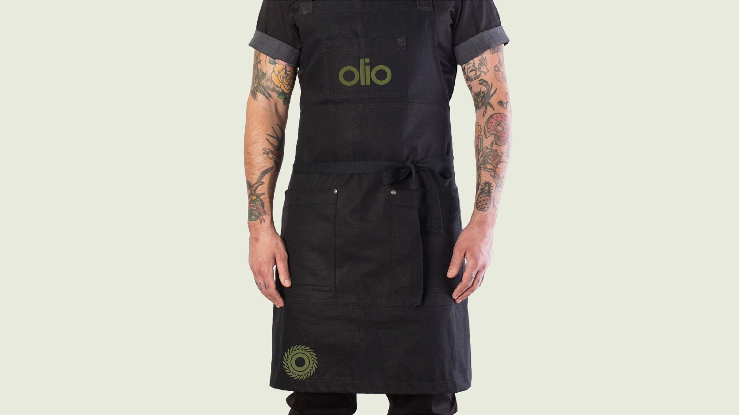
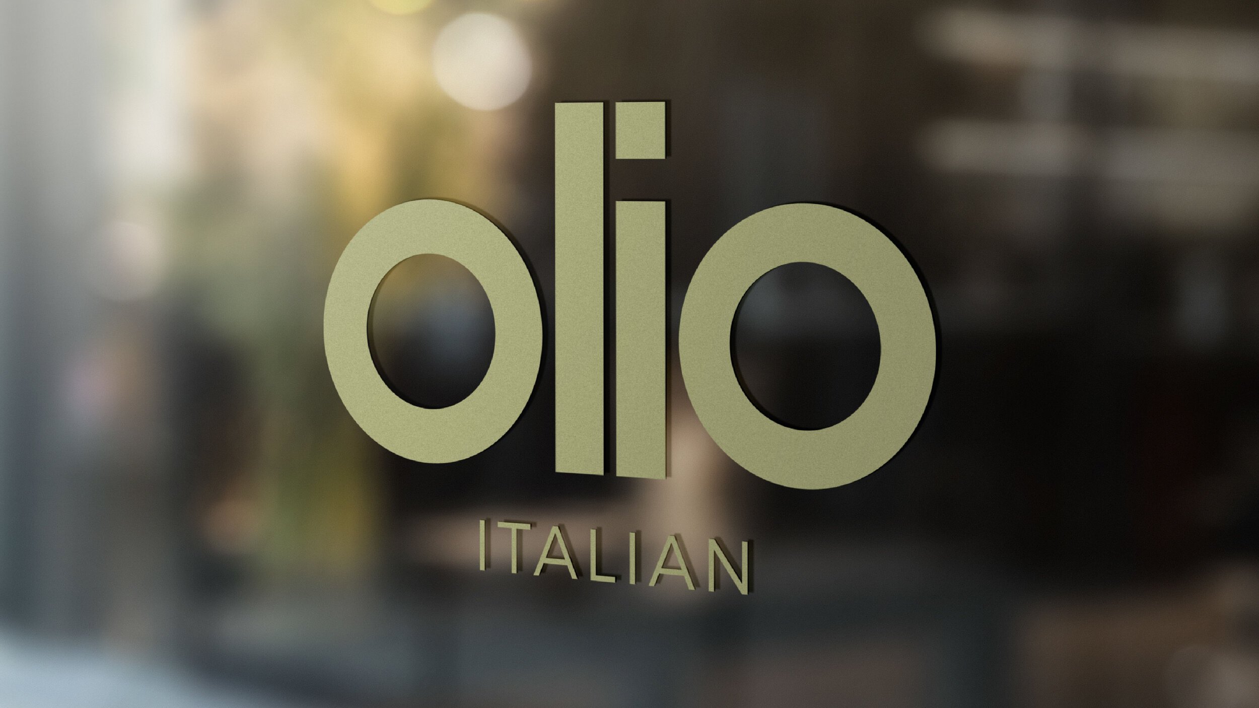
Every physical touchpoint, from the menus and takeaway packaging to the building signage, was designed to fit naturally into the physical space, keeping the entire guest experience under one clear system.


03 Outcome
The brand came together perfectly when the Cincinnati restaurant opened, contributing to a strong round of local praise. From the tableside menus to the front door signage, every piece communicated the same level of care guests felt in the food.