Case study · In-House
Inflection
Brand cohesion for Fortune 100 employee education.
Assets
Designed an expansive visual library for complex, sensitive topics like DivorceIQ and Eldercare, elevating user engagement across the platform.
Unified
Cleaned up brand architecture and established a scalable design system connecting the core platform across six distinct product lines.
Retention
Created high-trust pitch decks, employee onboarding journeys, and client success collateral that directly supported securing and renewing top enterprise accounts.
01 Challenge
Inflection covers deeply personal topics like fertility, menopause, and end of life care for Fortune 100 employees. As the company grew through multiple products, the visual identity fell apart and felt disjointed. Different versions of the Inflection logo were being used, along with an IQ identifier that was warped in some cases. By the time I joined, the company had five products and was getting ready to launch their sixth, and while similar, they all were slightly different from one another and didn't feel like a brand family. Nothing said Inflection except the logo at the top of the website.
02 Execution
My role was to create one trustworthy system for care offerings and for the teams shipping sales decks, member emails, and internal communications, so every touchpoint felt connected.
I audited the legacy assets and built a centralized brand hub so teams stopped inventing a new look for every project.
I met teams where they already worked. I created templates in Figma, Canva, and Google Slides so Sales, Communications, and Leadership could stay on brand without waiting on design.
I redesigned the email lifecycle so messages felt continuous instead of unrelated.
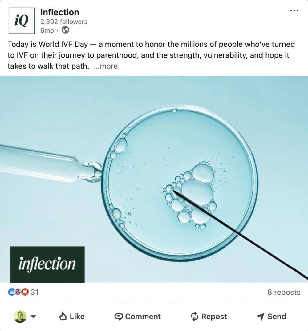
Social system for live seminars, observed days, and core brand posts, built for consistency across digital channels.
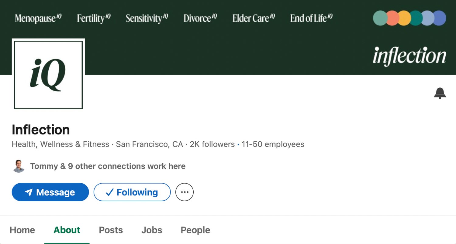
LinkedIn banner and avatar updated for the brand rollout so the company page matched the rest of the system.
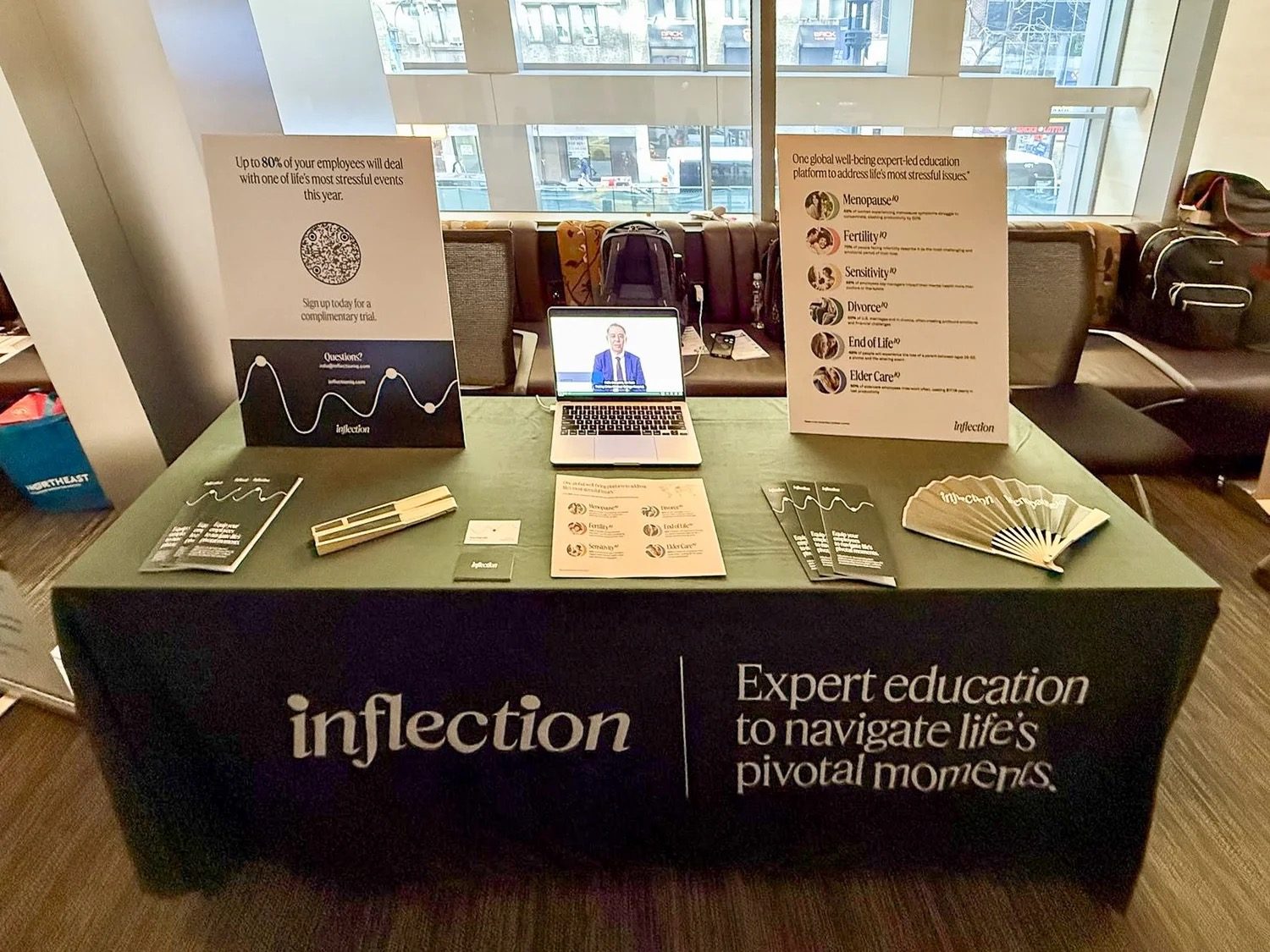
Display kit with posters, QR codes, handouts, and swag for monthly HR benefits events at Fortune 100 companies.
03 Outcome
Six product identities became one coherent system. A self-serve asset hub sped turnaround and cut off-logo one-offs. Custom sales and marketing materials supported retention and growth with Fortune 100 brands including two of the top three largest companies in the world, over 30% of Fortune’s “Best Places to Work,” and five of Fortune’s Top 30 Most Admired Companies.
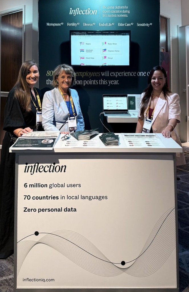
Spatial, graphic, and experiential design for the Inflection booth, along with accompanying materials and swag for the REBA conference in the UK. Wall graphics and the podium were designed to match the updated brand and new system.