Agra Wood
The Challenge
Agra Wood is a powerhouse in the Polish carpentry industry but their visual identity didn't match the level of their craftsmanship. They were respected for their technical expertise but they lacked a cohesive look that could effectively bridge the gap between their traditional European roots and the modern, high-tech standards they operate by today.
My Role
I led the brand transformation from the initial concept through to final execution. My goal was to move the company away from an outdated image and create a visual language that felt as sophisticated and professional as the work they produce.
Design Decisions
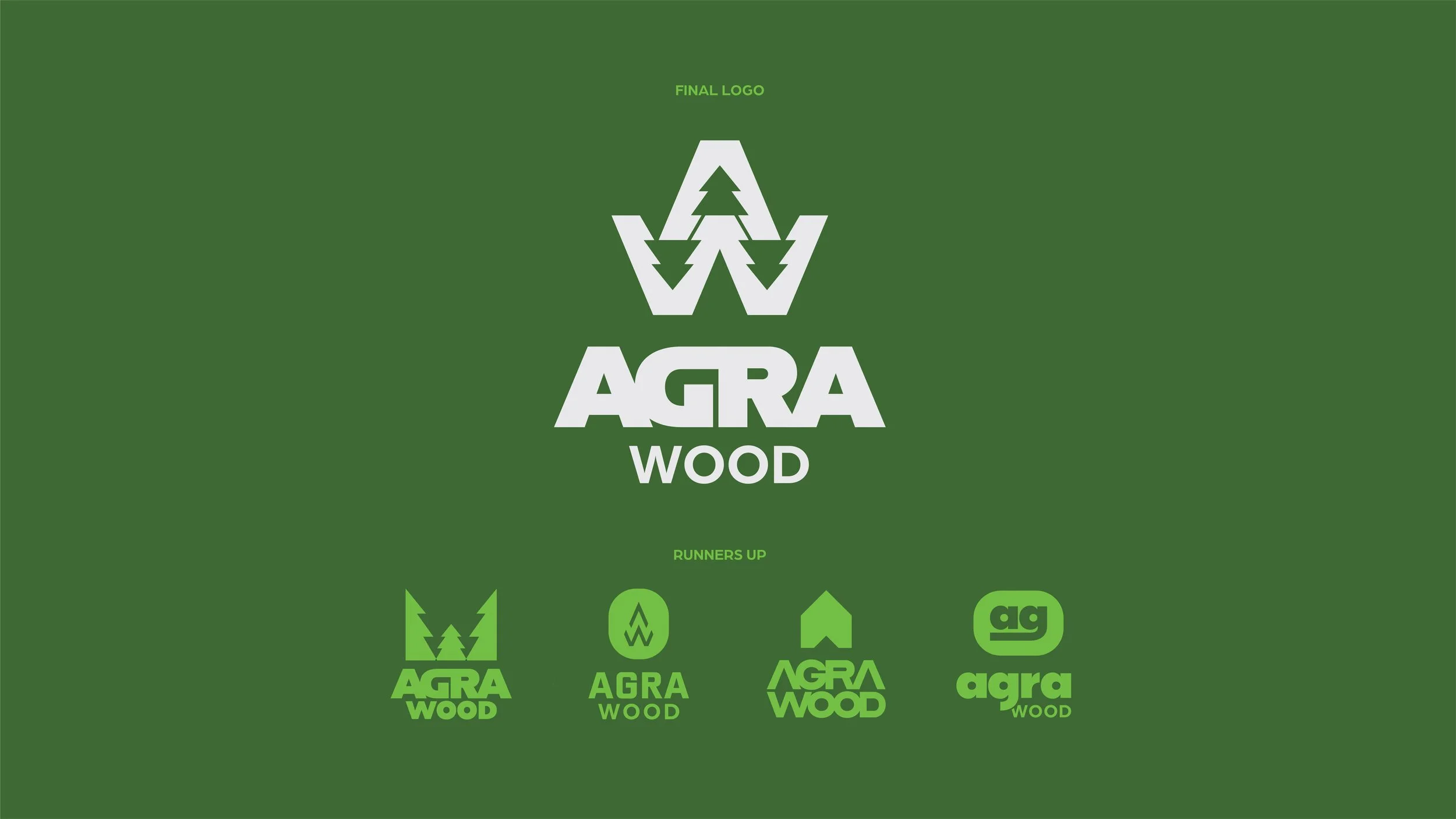
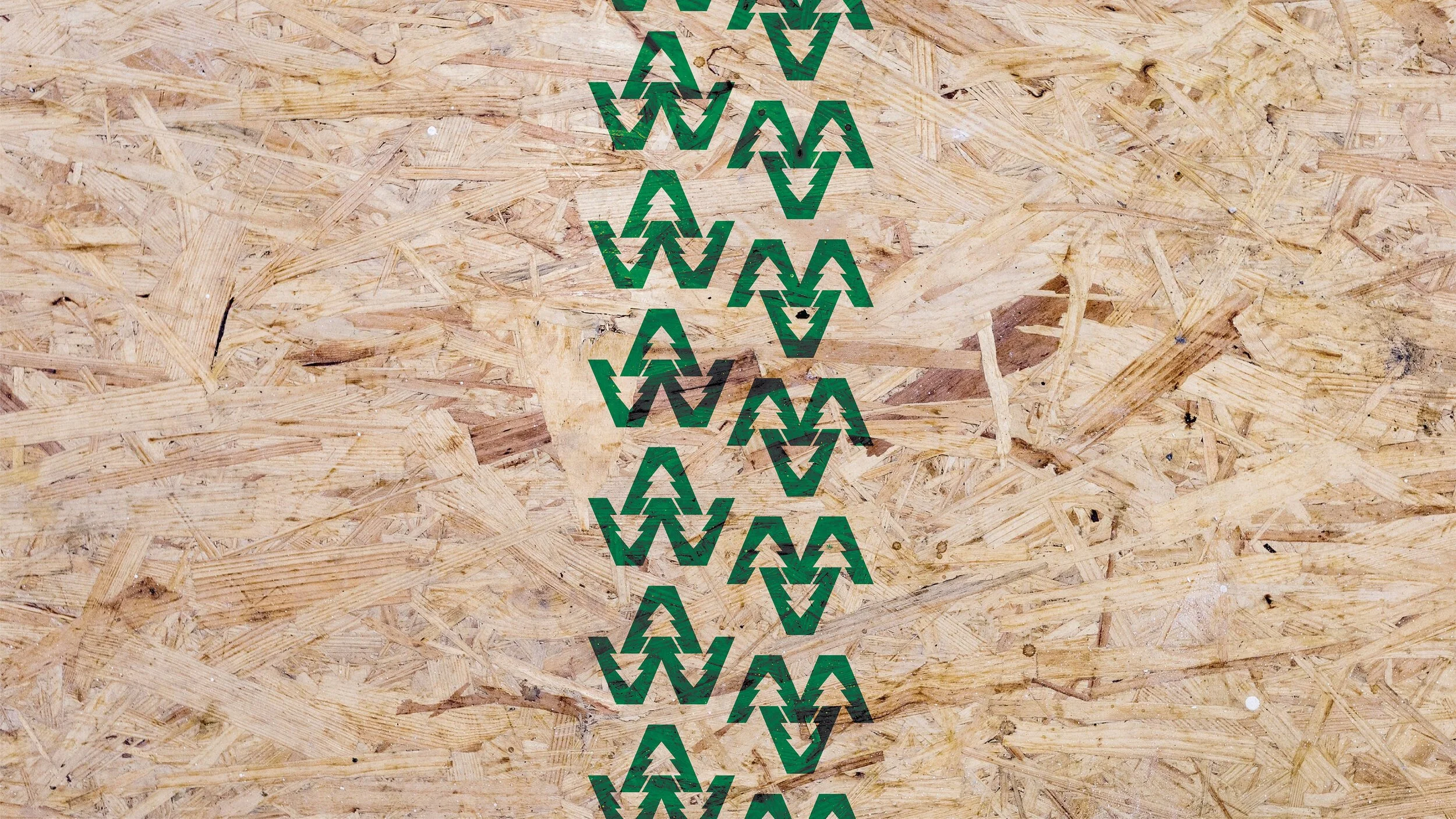
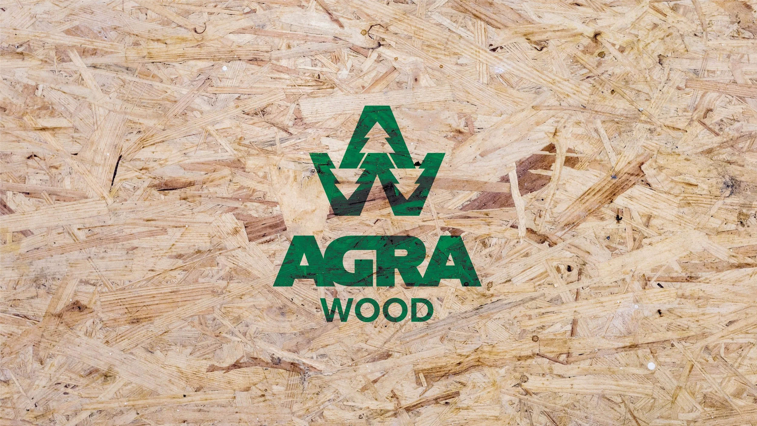
I chose the tree as our central mark. It’s a timeless symbol of strength and stability that tells the story of where the company started while feeling clean and modern enough for today's market.
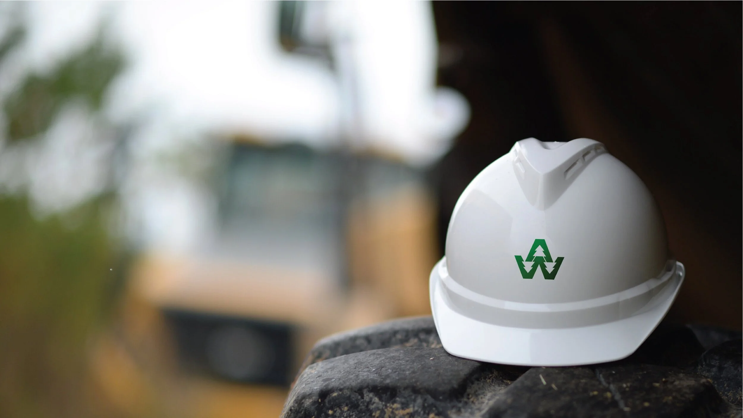
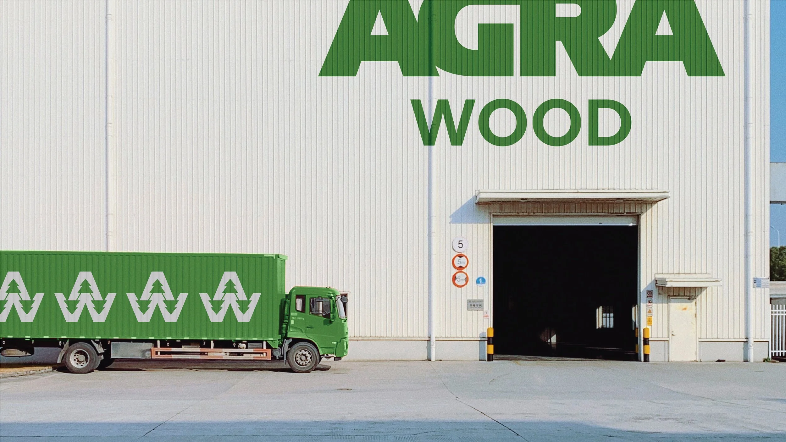
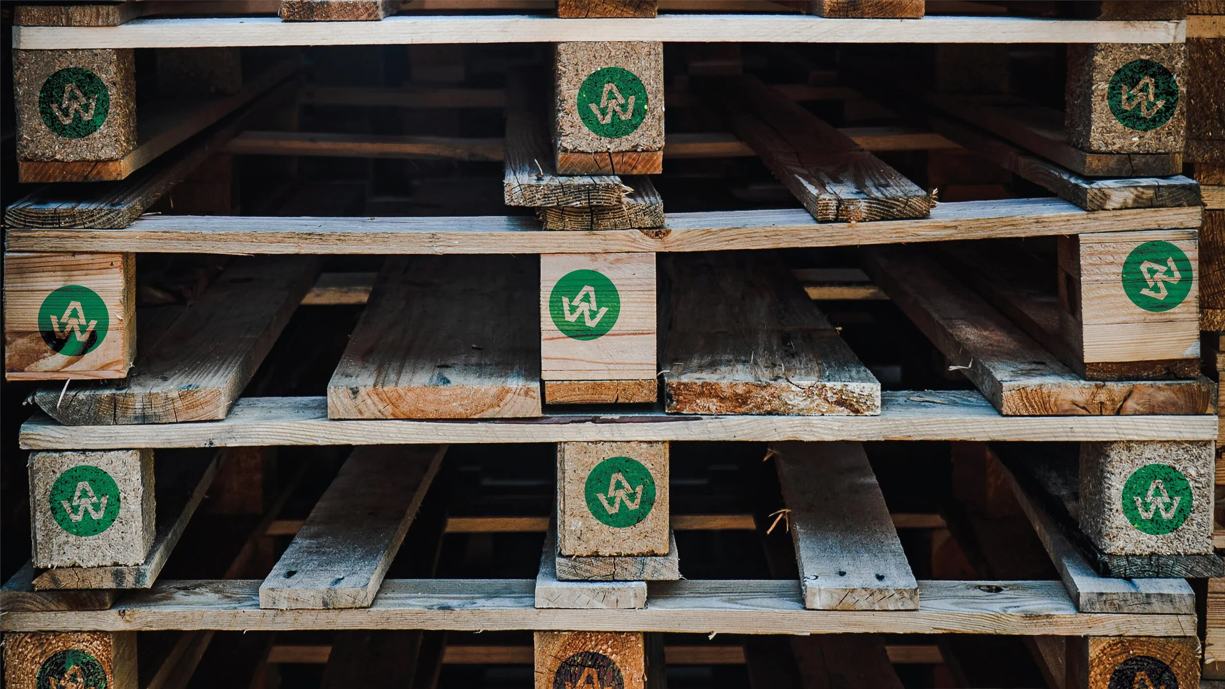
I developed a logo that had to work everywhere. Whether it was on a business card or the side of an 18-wheeler, I ensured the mark stayed legible and bold, maintaining visual integrity at any size.
Instead of just focusing on the finished product I centered the design on the lifecycle of the wood itself including building, crafting, and recycling.
The Outcome
The new identity successfully modernized Agra Wood’s presence allowing them to stand out in a crowded industrial market. Key results include:
Establishing a visual voice that commands respect from both clients and competitors.
Creating a cohesive brand system that reflects their transition from traditional carpentry to a modern technical leader.
Providing the company with a versatile set of assets that align their visual presentation with the quality of their equipment and technical processes.
Project Scope
Brand Identity
Logo Design
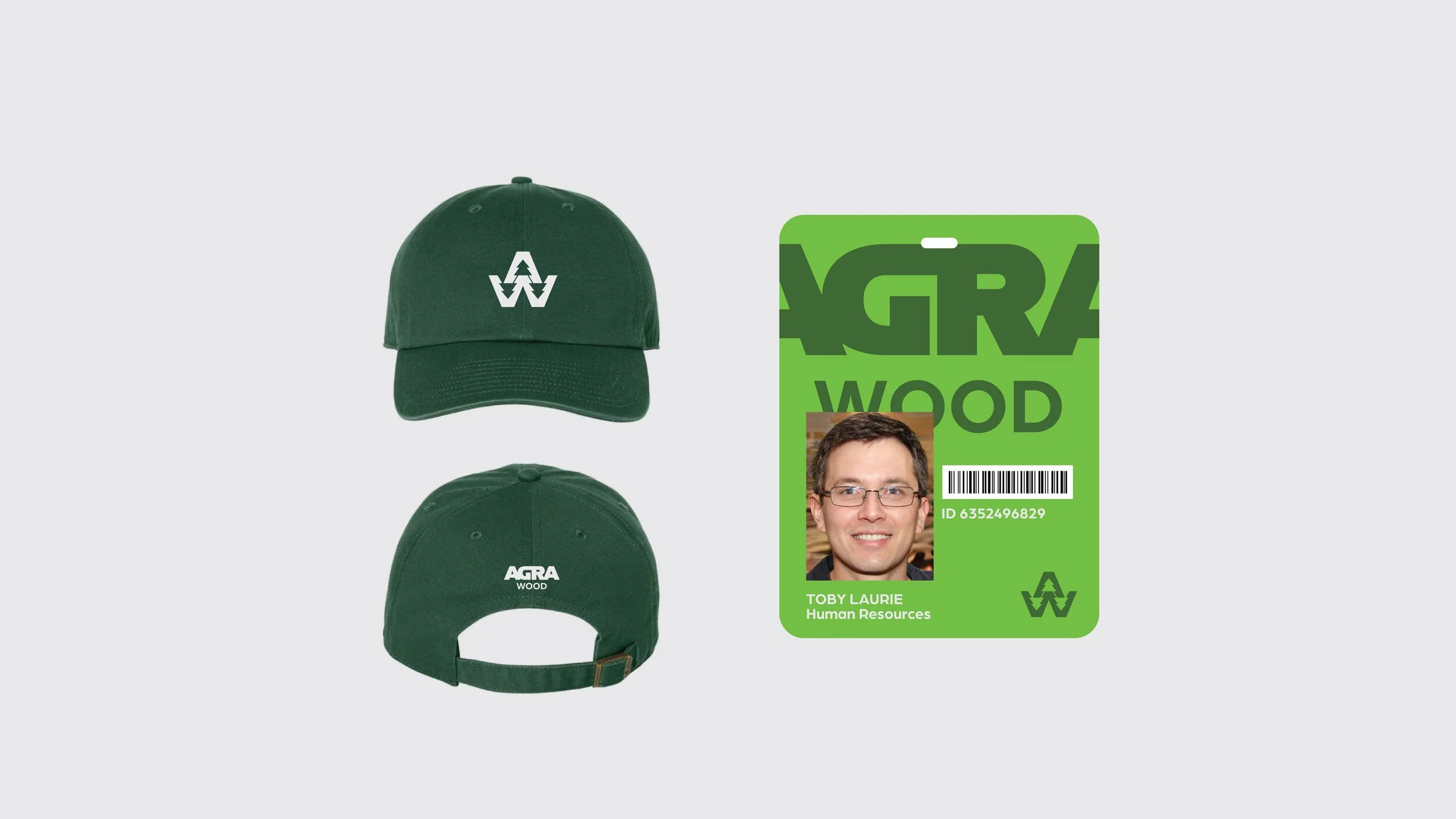
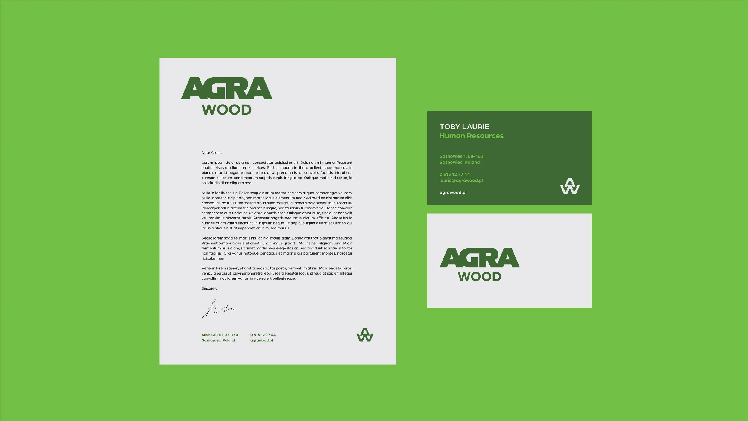
Collateral
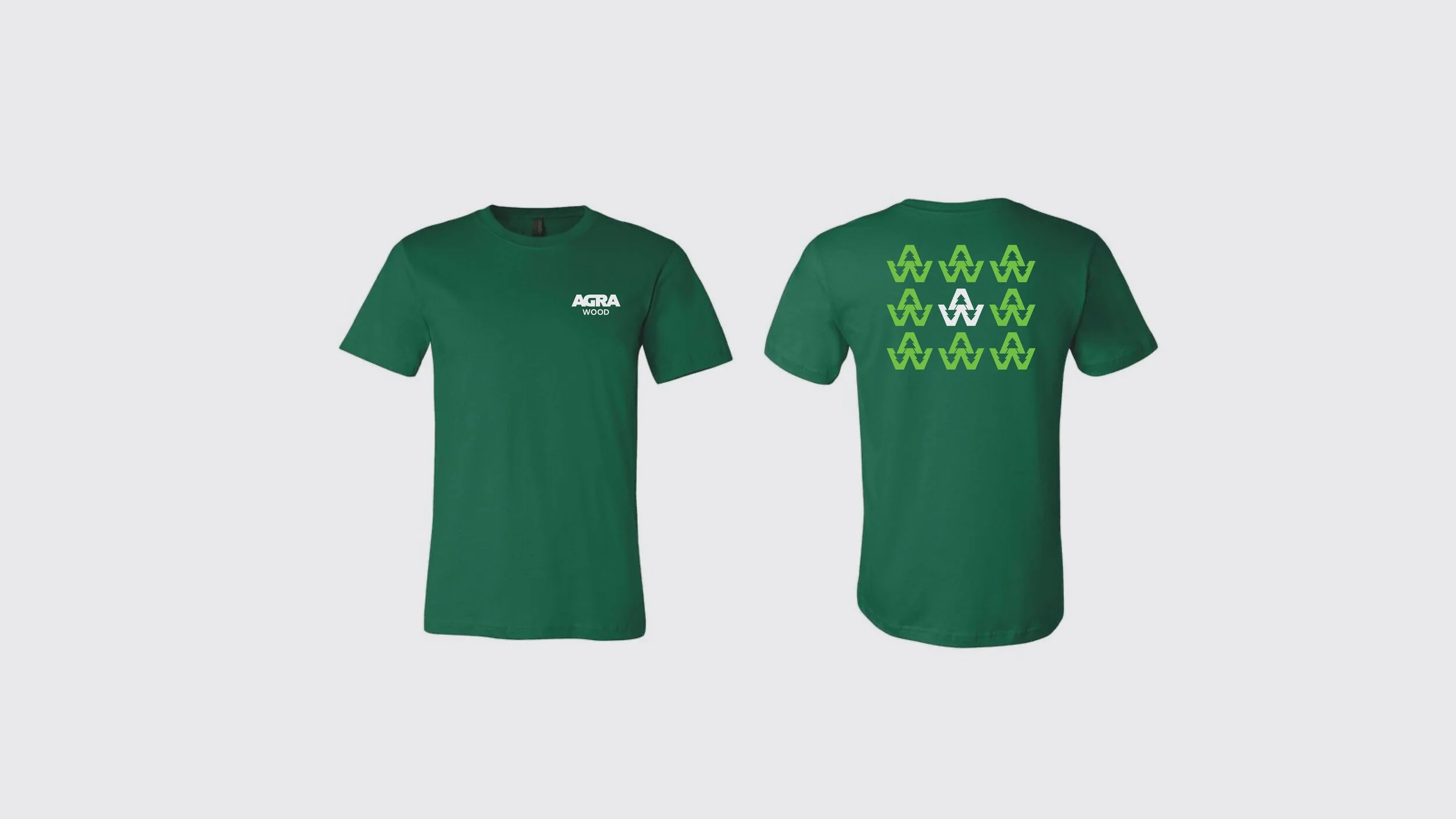
Staff Uniforms
Signage
Programs Used
Adobe Illustrator
Adobe Photoshop
Adobe Lightroom