Solmar
The Challenge
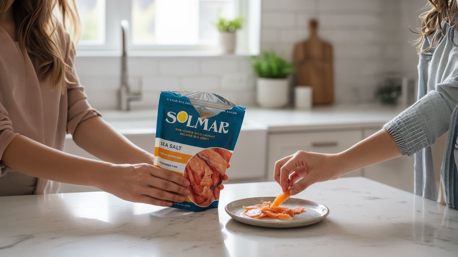
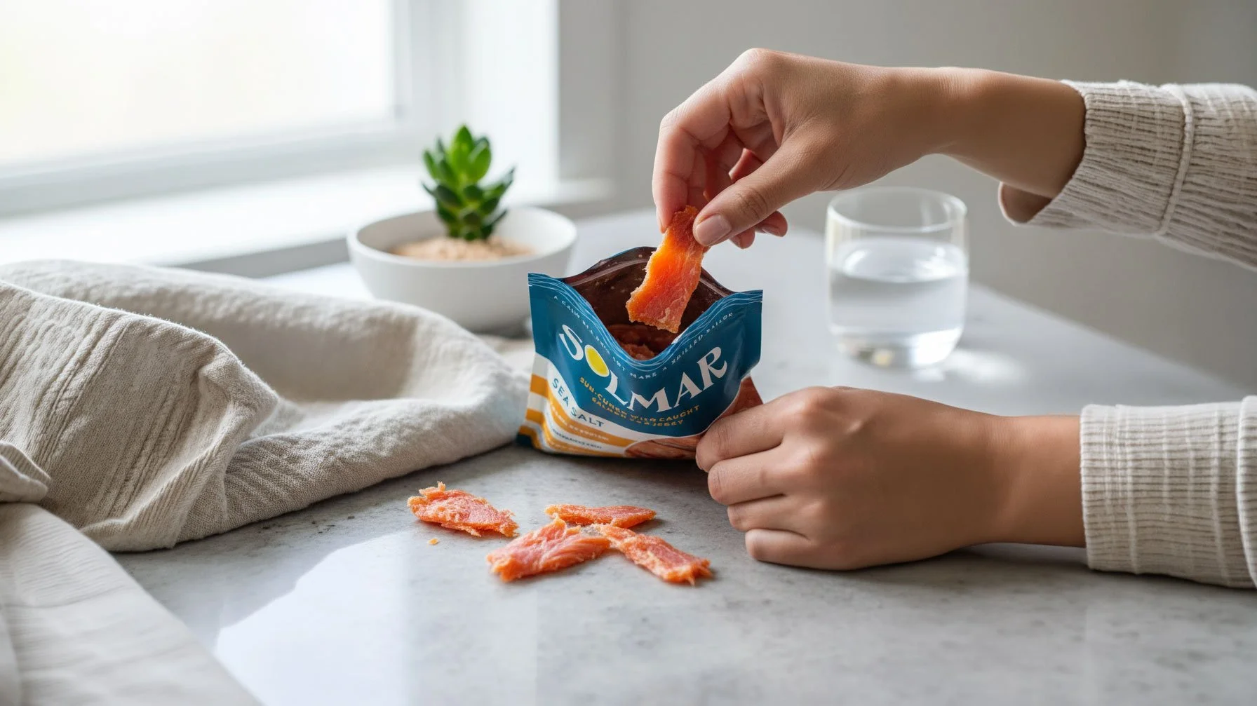
Solmar needed to launch a premium sea jerky that felt like a lifestyle brand rather than just another shelf-stable snack. The challenge was to move away from the gritty aesthetic of traditional jerky and instead capture the essence of Mediterranean coastal living to attract health-conscious consumers who value both quality and design.
My Role
I led the brand development from the ground up. I was responsible for helping to name the product, the full visual identity, and the packaging system, ensuring that the brand’s commitment to sustainability and high-quality, nutrient-dense ingredients was communicated through a fresh aesthetic.
Design Decisions
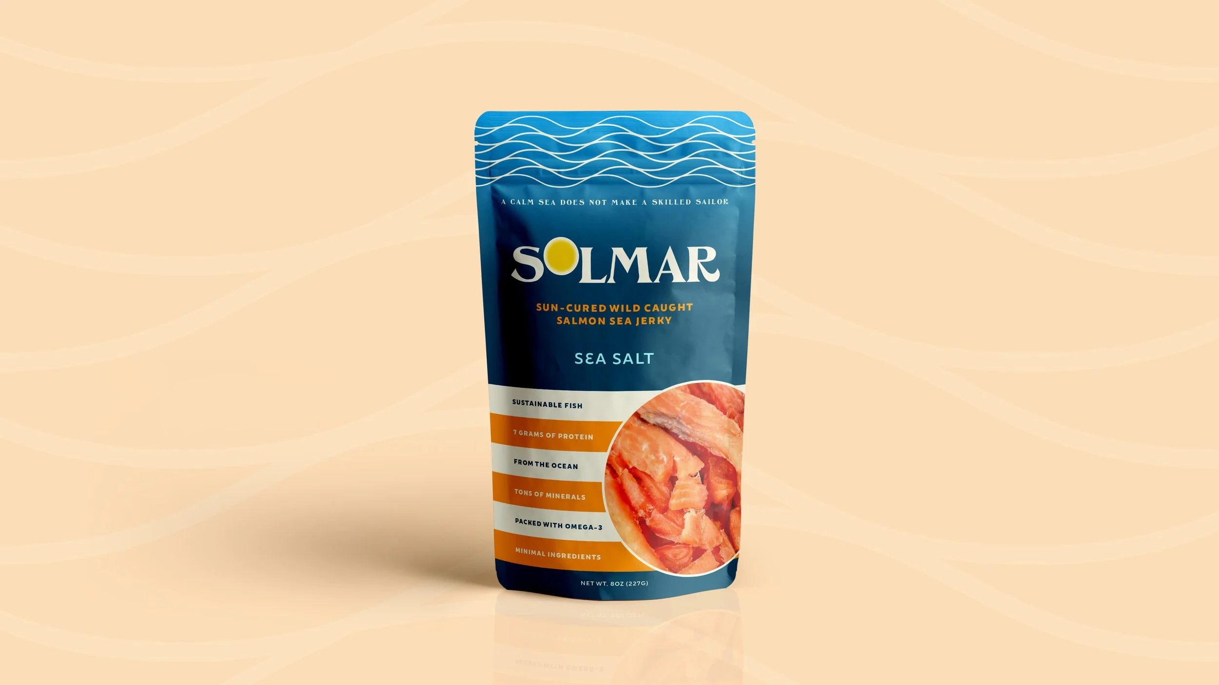
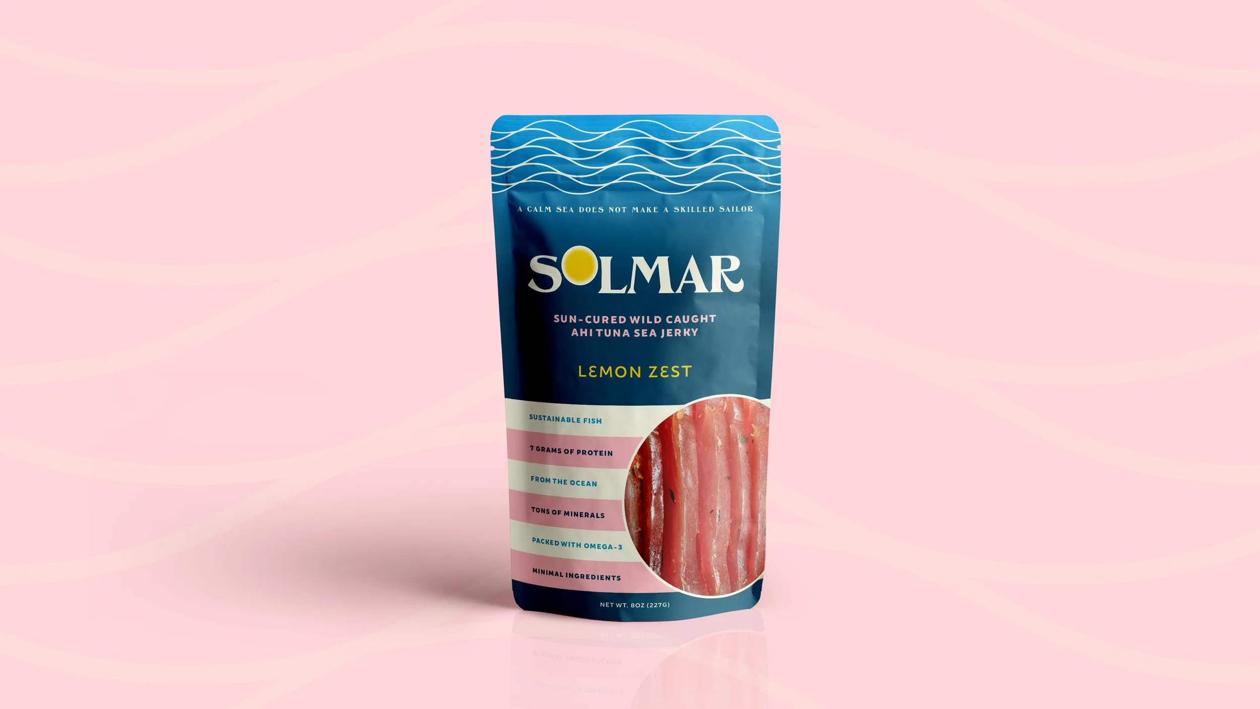
I drew inspiration from Italian coastal towns to create a sense of approachable luxury. I selected typography and a design style that felt laid-back yet chic, mirroring the product’s authentic seaside origins.
I moved away from standard jerky design tropes. By using bold, colorful stripes reminiscent of iconic Italian beach umbrellas, I created a packaging system that stops shoppers in their tracks and positions the brand as a premium lifestyle choice.
I used the color palette and custom iconography to anchor the brand in the simplicity of sun-cured methods and ocean purity. This made the commitment to sustainability feel like a natural part of the brand’s personality rather than a marketing add-on.
The Outcome
The new identity successfully establishes Solmar as a premium, lifestyle-driven snack brand. The design system is fully developed and ready for market entry, providing a clear competitive advantage in a crowded category. Key results include:
Created a unique aesthetic that breaks through the noise of traditional snack aisles, allowing the product to compete as a premium lifestyle choice rather than a commodity.
Successfully balanced a nutrient-dense value proposition, including 7 grams of protein and high omega-3 content, with a fresh, approachable visual voice that appeals to design-conscious health consumers.
Delivered a cohesive, shelf-ready brand system that aligns perfectly with the purity of the ingredients, positioning Solmar for immediate retail placement.
Project Scope
Brand Identity
Logo Design
Packaging
Voice
Programs Used
Adobe Illustrator
Adobe Photoshop
Adobe Lightroom
Adobe Firefly